Complete Beginner Guide to CSS Grid.
I am a front-end developer with 3+ years of experience. I create responsive websites with the use of HTML, CSS, Javascript/ jQuery, and React/Vue. I am also a graphics designer with 6 years of experience in logo designs, business card designs, presentation designs, banner designs and many more.
Introduction to CSS Grid:
CSS Grid is a two-dimensional grid-based layout system that allows you to design webpages easily without having to use floats or positioning.
Grid Container:
A grid layout consists of a parent container, which has one or more child elements.
Code Example:
<!DOCTYPE html>
<head>
<meta name="viewport" content="width=device-width, initial-scale=1.0"> <meta http-equiv="X-UA-Compatible" content="IE=edge">
<title>CSS Grids</title>
</head>

<body>
 <!--this is the grid parent container-->
    <div class="grid-container">
        <!--these are the grid child elements-->
        <div class="grid-element-1">1</div>
        <div class="grid-element-2">2</div>
        <div class="grid-element-3">3</div>
        <div class="grid-element-4">4</div>
        <div class="grid-element-5">5</div>
        <div class="grid-element-6">6</div>
    </div>
</body>
</html>
To make this a grid container, we declare either display: grid or display: inline-grid to the parent container, grid-container. As soon as we do this, all grid child elements of the grid parent container become grid items.
div.grid-container{
    display:grid; /*display grid property*/
    background: skyblue;
    padding:10px;
}
div.grid-container > div{
  /*styling the grid child elements*/
 background-color: #888;
  text-align: center;
  padding: 20px 0;
  font-size: 30px;
}
Output:

Grid Gaps
The spaces between each column and row of a grid element are called grid gaps.
The shorthand property is grid-gap . It's now known as gap in CSS3.
Syntax: grid-gap: grid-row-gap| grid-column-gap or gap: row-gap| column-gap
The row-gap property is specified only for grid rows. Example: row-gap:20px;
The column-gap property is specified only for grid columns. Example: column-gap:30px;
Code Example:
div.grid-container {
  display: grid;
  gap:10px; /*both row and column*/
}
Output:

Grid Columns
Grid Columns are the vertical lines of the grid child elements.
The lines between grid columns are called column lines**.**
Grid Template Columns
The grid-template-columns property specifies the number (and the widths) of columns in a grid layout.
The values are a space-separated list, where each value specifies the size of the respective column.
Syntax: grid-template-columns: none|auto|max-content|min-content|length|initial|inherit;
Values explained:
none | Default value. Columns are created if needed |
auto | The size of the columns is determined by the size of the container and the size of the content of the items in the column |
max-content | Sets the size of each column to depend on the largest item in the column |
min-content | Sets the size of each column to depend on the smallest item in the column |
length | Sets the size of the columns, by using a legal length value. |
initial | Sets this property to its default value. |
inherit | Inherits this property from its parent element. |
In the example below, we'll create a 3-column grid container.
Code Example:
div.grid-container{
    display:grid;
    gap:10px;
    grid-template-columns: auto auto auto;
}
Output:

Let's create another 3-columns grid container and specify a size for each column.
Code Example:
div.grid-container {
   display: grid;
   gap:10px;
  grid-template-columns:  30px  100px auto;
}
Output:

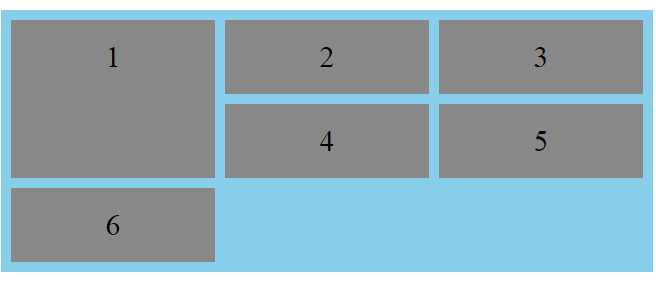
We use the following properties, grid-column-start and grid-column-end , when we want to place a grid item on a grid container to specific column lines.
The values used are number values.
In the example below, we are placing grid-element-1 at column line 1, and let it end on column line 4:
Code example:
div.grid-container{
  display: grid;
   gap:10px;
  grid-template-columns:  auto auto auto;
}
div.grid-element-1{
   grid-column-start:1;
   grid-column-end:4;
}
Output:

Grid Rows
Grid rows are the horizontal lines of the grid child elements.
The lines between grid rows are called row lines**.**
Grid Template Rows
The grid-template-rows property specifies the number (and the heights) of rows in a grid layout.
The values are a space-separated list, where each value specifies the size of the respective row.
Syntax: grid-template-rows: none|auto|max-content|min-content|length|;
Values explained:
none | Default value. Rows are created if needed |
auto | The size of the row is determined by the size of the container and the size of the content of the items in the row |
max-content | Sets the size of each row to depend on the largest item in the row |
min-content | Sets the size of each row to depend on the smallest item in the row |
length | Sets the size of the rows, by using a legal length value. |
Code Example:
div.grid-container{
display:grid;
gap:10px;
grid-template-columns:auto auto auto;
grid-template-rows: 300px 200px;
}
Output:

We use the following properties, grid-row-start and grid-row-end , when we want to place a grid item on a grid container to specific row lines.
The values used are number values.
In the example below, we are placing grid-element-1 at row line 1, and let it end on row line 3.
Code Example:
div.grid-container{
display:grid;
gap:10px;
grid-template-columns:auto auto auto;
}
div.grid-element-1{
grid-row-start: 1;
  grid-row-end: 3;
}
Output:
Aligning Grid Items
- The justify-content property
The justify-content property is used to align the whole grid elements inside the grid parent container.
Values: start end center space-between space-around space-evenly
Note that, the total width of the grid element has to be less than the width of the grid parent container for the justify-content property to have any effect.
Code Example:
div.grid-container {
  display: grid;
  gap:10px;
 justify-content: space-between;
  grid-template-columns: 50px 50px 50px; /*Make the grid smaller than the container*/
}
Output:

The align-content property
The
align-contentproperty is used to vertically align the whole grid elements inside the grid parent container.Values:
startendcenterspace-betweenspace-aroundspace-evenlyNote that, the total height of the grid element has to be less than the height of the grid parent container for the
align-contentproperty to have any effect.Code Example:
div.grid-container {
  display: grid;
  height: 400px;
  align-content: space-evenly;
  grid-template-columns: auto auto auto;
  gap: 10px;
}
Output:

Shorthand Properties
The grid-column property
The
grid-columnproperty is a shorthand property for thegrid-column-startand thegrid-column-endproperties.To place a grid item/element, you can refer to line numbers, or use the keyword "span" to define how many columns the grid item/element will span.
Syntax:
grid-column: grid-column-start(number) / grid-column-end(number);Code Example:
Make grid-element-1 start on column 1 and end before column 4:
div.grid-container{
display:grid;
gap:10px;
grid-template-columns:auto auto auto;
}
div.grid-element-1{
grid-column: 1 / 4;
}
Output:
Using span,
Syntax: grid-column: grid-column-start(number) / span grid-column-end(number);
Code Example:
Make grid-element-1 start on column 2 and span 2 columns.
div.grid-container{
display:grid;
gap:10px;
grid-template-columns:auto auto auto;
}
div.grid-element-1{
grid-column: 2 / span 2;
}
Output:

The grid-row property
The
grid-rowproperty is a shorthand property for thegrid-row-startand thegrid-row-endproperties.To place a grid item/element, you can refer to line numbers, or use the keyword "span" to define how many rows the grid item/element will span.
Syntax:
grid-row: grid-row-start(number) / grid-row-end(number);Code Example:
Make grid-element-1 start on row-line 1 and end on row-line 4:
div.grid-container{
display:grid;
gap:10px;
grid-template-columns:auto auto auto;
}
div.grid-element-1{
grid-row: 1 / 4;
}
Output:

Using span,
Syntax:
grid-row: grid-row-start(number) / span grid-row-end(number);Code Example:
Make grid-element-1 start on row 1 and span 2 rows.
div.grid-container{
display:grid;
gap:10px;
grid-template-columns:auto auto auto;
}
div.grid-element-1{
grid-row: 1 / span 2;
}
Output:
The grid-area property
The
grid-areaproperty is used as a shorthand property for thegrid-row-start,grid-column-start,grid-row-endand thegrid-column-endproperties.
Code Example:
Make grid-element-3 start on column 1, row 2 and end on column 4 and row 3.
div.grid-container{
display:grid;
gap:10px;
grid-template-columns:auto auto auto;
}
div.grid-element-3{
grid-area: 1 / 2 / 4 / 3;
}
Output:

Using span,
Code Example:
Make grid-element-3 start on column 2, row 1 and span 2 columns and 3 rows.
div.grid-container{
display:grid;
gap:10px;
grid-template-columns:auto auto auto;
}
div.grid-element-3{
grid-area: 2 / 1 / span 2 / span 3;
}
Output:

Naming Grid Items using the grid-area property
In assigning names to grid items/elements, the grid-area property is used.
Named grid items/elements can be referred to by the grid-template-areas property of the grid container.
Code Example:
Give grid-element-1 the name of "grid1" and span all five columns.
div.grid-container {
  display: grid;
  grid-template-areas: 'grid1 grid1 grid1 grid1 grid1';
  gap: 10px;
}

div.grid-element-1 {
  grid-area: grid1;
}
Output:

We can use period signs (.) to represent a grid item/element with no name.
Code Example 1:
Span only two columns out of five columns.
div.grid-container {
  display: grid;
  grid-template-areas: 'grid1 grid1 ...';
  gap: 10px;
}

div.grid-element-1 {
  grid-area: grid1;
}
Output:

Code Example 2:
Span only two columns and two rows.
div.grid-container {
  display: grid;
  grid-template-areas: 'grid1 grid1 ...' 'grid1 grid1 ...';
  gap: 10px;
}

div.grid-element-1 {
  grid-area: grid1;
}
Output:
